A prototype’s purpose is to help you avoid building the wrong thing
Prototypes are fast and cheap, but only if they have focus.
Before you begin, you must know what you want to learn. You might want to know if your idea has legs, or how a new feature might work.
A prototype that tries to do too much can be slow and expensive to make. Which defeats the point.
To find the focus of your prototype, you need to work out what assumptions you have, and which are most important to test.
Ask yourself, or your team the following questions:
What do we believe to be true?How much evidence do we have that it is true,
and how bad would it be if we're wrong?
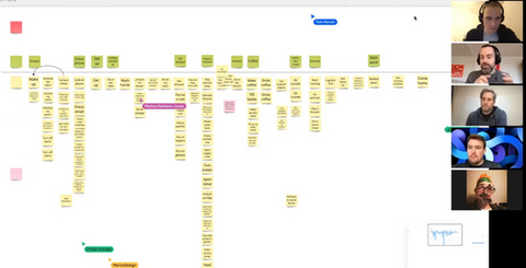
You can feed your answers into an assumption map. It helps you prioritise your riskiest and most unknown beliefs.
Your highest priority assumption can then be turned into a hypothesis statement. Framing what you're doing as an experiment sets the expectation that failure is OK.
Turn your assumptions into a hypothesis:
Because we saw [quantitative/qualitative insight] we believe [this assumption statement is true].
We will know we’re [right/wrong] when we see the following feedback: [qualitative feedback] and/or [quantitative feedback] and/or [key performance indicator change].
A hypothesis statement states what you believe, what you’ll do to prove yourself right or wrong, and the outcome you expect to see.
A hypothesis determines a lot about how you build and test your prototype.
Here's a real hypothesis I used for Workshop Tactics in 2018:
Because I saw people struggling with what design workshop to run, and when
I believe designers will buy a curated set of workshop recipe cards with a system that helps them choose the right workshop.
I will know I'm right when I see the following feedback: people asking when it's available and/or email sign ups to get on the pre-order waiting list.
This hypothesis has clearly set out certain aspects of my prototype. It simultaneously asks, and answers:
- What level of fidelity should the prototype be?
It's an idea, so it needs to appear as real as possible, on a live website.
- Who is my ideal customer or user?
I allude to UX designers, but I later learned it was more than that!
- How will it work?
It will be a landing page to capture emails, so it needs to be a functioning website.
If your idea or feature still has unclear details on how it works, it helps to make a storyboard. It’s almost like a prototype of the prototype!
Sketch out a storyboard of your idea
It’s more fun and productive to do this in a storyboard workshop. Tell the story of who, when, why, how and what. It’s cheap to amend a prototype at this imaginary stage. The value comes from the answers each panel of the story asks:
- Who is using your prototype?
- What is the person doing before they use it?
- Where are they when they use it?
- What problem led them to use it?
- How does this help them solve it?
- What happens when they do this?
- What do they need to know at this point?
- What does the user expect to happen next?

This exercise helps you pay attention to the context of the prototype. As well as what it should do at any given point. What you end up with is a plan for what to build, who to test with, and how.
Depending on what you’re trying to learn, prototypes can take many forms
Prototypes aren’t restricted to the use of click through user interfaces that test a sequence of steps.
People often get hung up on what fidelity their prototype should be. The fidelity of the interface depends on what you’re trying to test. Here's some examples of different prototypes and their purpose.
- a landing page to test the interest of a new product
- a display ad to test a strap-line or value proposition
- a basic HTML form to test a sign up process
- headline copy to test the idea is understandable and persuasive
- a web page to test an experimental function like a data API
- a conversation with a customer to test what you believe about them
Be mindful of testing low-fidelity or ‘paper’ prototypes
Like a storyboard, paper prototypes an excellent way to sketch out the thing you intend to make.
You can play around with it yourself and get quick feedback from colleagues. But they are only useful up to a certain point.
Paper prototypes become problematic when you test them with your intended audience.
The best prototypes for testing concepts elicit a natural response.
When testing ideas, the more someone believes what they’re using is real, the more useful your experiment. It only needs to appear real, like a Wild West facade on a Hollywood movie set. As long as people watching the film believe it, it doesn't matter how messy it is behind the scenes.
When you present someone a paper prototype, you have to do a lot of preamble and explaining.
‘This is a test; it’s not real. It won't look like this when it’s finished. You'll have to imagine some bits.’
And here is where the problem begins. When you ask someone to imagine, you invite uncontrolled variables into your test.
Explanation reduces the chance you'll learn something useful.
It’s hard to get a gut reaction when someone has to work to fill the gaps of your prototype - or already knows them.
To get the most out of testing a prototype, say as little as possible
The most challenging moment is when someone gets stuck or confused. You’ll want to help them. But you must fight the urge! Keep quiet!
What they do and say in these frustrating moments is vital. These observations will teach you more than anything else. A great product or service is one that has no frustrating moments. So your number one goal is finding and eliminating them.
Keeping quiet is especially important when you are testing a big idea. I see it all the time, people can’t help but give a brief explanation. This tends to happen when the designer lacks confidence in what they’re sharing - a fear of failure.
The preamble gives them a better chance of getting the answer they’re looking for. Defeating the purpose of the test.
The more you say upfront, the less useful the test will be. You’ll only get a gut reaction once, so make it count.
What people do is more important than what they say
Yes, a verbal gut reaction is a good indicator if you’re testing an idea. But when it comes to testing if someone will buy your product, what’s more concrete?
Cash in the bank or hearing “Yes, I would buy this”.
When testing, don’t take what people say at face value. It’s an easy trap to fall into. In this case, your skills of observation are far more important than your ability to listen.
It’s not that it’s a lie. It’s that predicting your own future behaviour is unreliable. If I tell you I’m definitely going to the gym tomorrow, would you believe me? Or would you rather believe CCTV footage of me sat at home eating pizza?
Another typical example is watching someone struggle with your click-through prototype. Then afterwards, they smile and tell you how easy it was.
People say things for all kinds of reasons. They don’t want to upset you. They want to help you. Or they might not know what to say at all. So if in doubt, ignore what people say and pay attention to what they do.
There's only so much you can learn before your prototype has served its purpose
‘Proto’ means first. That implies there will be more iterations of your prototype. Eventually, you'll hit a ceiling. You won't learn anything new. And you’ll become constrained by the technical abilities of the prototype itself.
In the world of software development, the sooner you can ship live code, the better. If you stay in prototype-land too long, you risk becoming wedded to a solution that hasn't had its technical assumptions tested.
Don’t become too attached to your prototype. You must be willing to throw it away. Especially when you move into developing the real thing.
A prototype’s job is to give you 75% confidence that you’re going to spend time and money making the right thing.

Be aware of your bias for success
We root for our bets to win. And a prototype is our bet manifested. Even being aware of your it doesn’t always stop you from being biased. You will unconsciously nudge your participants towards the right answer.
Bias seeps into how you ask questions, and the answers you give. A way to combat this is to have colleagues or teammates who are less invested, do the testing with you.
Even better, adopt a null hypothesis for each experiment. Which is the opposite claim of the hypothesis you are testing. That way, you’ll have a balance of people rooting for different outcomes.
Whatever kind of prototype you make, remember these three principles
- What you learn is only as good as your ability to keep quiet.
- Your prototype is only as good as your hypothesis.
- Your hypothesis is only as good as your ability to bring your team together and prioritise everyone's assumptions.


