Contents
- Introduction
- What is a Wardley Map?
- How to create a Wardley Map
- Why are Wardley Maps useful?
- Tools for Wardley Mapping
- How to run a Wardley Map workshop
- How do you know what to map?
- How do you read a Wardley Map?
- When do you use a Wardley Map?
- How do you use a Wardley Map to help you prioritise?
- How can Wardley Maps be useful if they aren’t accurate?
- Summary and useful links
Introduction
Do you remember the last time someone asked you for directions?
Why the hell don't they just use Google Maps? Everyone has it now.
Humans have used maps for a long time, but they haven’t always been the near-perfect digital maps we know of today. We used landmarks to guide us, and it is those landmarks we told each other about to help us navigate the world.
“Turn left at the Big Stone, and carry on until you meet the Big Forest. At night, keep the moon behind you.”
Then we surveyed the land using telescopes and triangulation. And before you know it, we've launched satellites into orbit. Now we can pinpoint our exact location in real-time (thanks Hedy Lamarr , and Albert Einstein!).
Maps have always had one primary purpose: to help us see where we are and where we can go. A Wardley Map does just that, but for the world we can’t see. It’s a way of revealing the systems that underpin anything - from business to technology.
This article serves as an introduction to Wardley Mapping.
There will always be more you can learn, but this might be enough to give you the bug to explore Wardley Mapping further. I find it to be an incredibly useful tool. Though it can be easy to learn the theory, it’s hard to master in practice. Fortunately, there is a lot to gain from studying even an inaccurate Wardley Map, as we will discover later.
What is a Wardley Map?
View map on Online Wardley Mapper

A Wardley Map visually depicts the components in a system to help you understand it better, so you can make more user-centered strategic decisions; much like an army general would look at a map to inform his next military move. Wardley Maps reveal the possibilities available to you in the context of business.
Simon Wardley was convinced other CEOs were using some kind of map. A map that would show the business landscape to help them make decisions. Wardley spent a long time searching for such a thing. But after failing to find one, Wardley created it himself.
Wardley describes most businesses as a game of chess. Except they can’t see the chessboard itself. They can only see a record of the moves played. Some sequences work better than others, but no one knows why. So businesses copy what works, without thought or strategy.
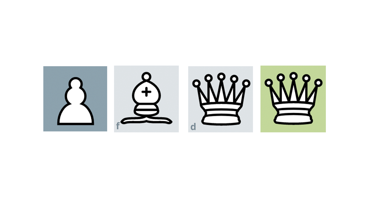
But with a Wardley Map, the chessboard is visible - and it becomes clear why some moves work better than others. Like a chessboard, a Wardley Map has position and movement. These characteristics are vital for coming up with a robust strategy. Without them, we are blindly making moves and hoping for the best.

Two fundamental principles emerge from position and movement: leverage and evolution.
These principles are critical to understanding Wardley Mapping;
- Leverage - established things enable new things to emerge.
- Evolution - market forces evolve new things into established things (which then leverage other new things, and the cycle continues).
It's a lot to take in at once, but bear with me. We'll break down how a Wardley Map works, and these principles will become clearer.
How to create a Wardley Map
Like a board game, you’ll understand it faster by playing. So let’s look at an example of a Wardley Map and how it can help you see you how a cup of coffee can exist.

Photo by Robin van der Ploeg
For a cup of coffee you need:
- a cup
- coffee machine
- coffee beans
- water
- computation
- electricity
Now let's connect them based on their dependencies.
Our user is dependent on their cup of coffee.
Their cup of coffee is dependent on a coffee machine.
The coffee machine is dependent on a vast amount of things, but to give us focus, we'll focus on the essentials: coffee beans, water, computation, and electricity.

This is the ‘value chain’, which is the Y-axis of a Wardley Map. The most visible things to the user are at the top. The least visible at the bottom. The question you ask to uncover the components involved is “what exists to make this possible?” or more simply “what does this need?”.
Next, we move these components approximately along the X-axis of 'evolution'. There are four phases of evolution: Genesis; Custom; Product; Commodity.

To plot something on the X-axis, you have to determine how evolved it is. Is it brand new and untested? Or is it established and robust? By plotting the components in the value chain based on their evolution phase, a useful map begins to emerge.
Click image to enlarge.

We've taken our value chain, and moved each component roughly to which phase of evolution it's in. We've created a simple Wardley Map.
How do you know how evolved something is?
On the left, you have new emergent things. These are components that are exciting, prone to failure, and have a high future value. For example, the first ever battery was highly unstable and prone to failure. There was no market for it - no products that you could fit a battery into. But its potential was exciting.
On the right, you have established and commodified things. For example, electricity is a commodity we use every day. We don’t expect it to fail, and when it does, it can be catastrophic. The only value to be gained here is reducing margins of how efficiently you can produce electricity.
There are a lot of factors to determine which phase a component is in. Here is a handy cheat sheet to help you.
| Market | Failure | User Perception | Focus of value | Comparison | |
|---|---|---|---|---|---|
| Genesis | Undefined. | High, tolerated, assumed. | Different, confusing, exciting, surprising. | High future worth. | Constantly changing, a differential, unstable. |
| Custom | Forming. | Moderate, unsurprising but disappointed. | Cutting edge, emerging. | Seeking profit and ROI. | Learning, testing, some evidential support it works. |
| Product | Growing. | Not tolerated, focus on continuous improvement. | Common, disappointed if not used or available. | High profitability. | Feature difference. |
| Commodity | Mature. | Operational efficiency, surprised by failure. | Standard, expected. | High volume, reducing margin. | Essential, operational advantage. |
Wardley Mapping, Evolutionary Characteristics Cheat Sheet courtesy of Simon Wardley, CC BY-SA 4.0. From a Miro template canvas by Ben Mosior.
Mature, evolved components leverage new and novel components. Computer-driven coffee machines are a relatively recent invention. What once required a person to operate, is now automated by computation.
Electricity, manufacturing processes and computational power has enabled the existence of the coffee machine.
This is the leverage principle that Wardley Maps reveal. They help you look at a business in terms of what commodities it has as its disposal to leverage new technology, features or services.
Click image to enlarge.

The principle of the evolution X-axis is that everything evolves. But time is not the only driving factor of evolution. Something only evolves if capitalistic forces are causing it to develop. It needs enough supply and demand. We wouldn’t have invested in power grids if it wasn’t worthwhile to do so.
In the case of our automatic coffee machine, there is a demand to reduce labour, and there is a demand for coffee. It's only logical then that the coffee machine was going to evolve when there is so much available (computation, electricity, manufacturing processes) to leverage into existence.
So the question now is: what new offering can be leveraged by having reliable automatic coffee machines? A drive-through coffee shop with no employees? What other dependencies do you need to make that happen? Do they already exist? If not, what do you have that can leverage them into existence?
Click image to enlarge.

This is just a flavour of how Wardley Maps can help you strategise new services and products.
Why are Wardley Maps useful?
We've just briefly covered the two important principles to remember when creating or reading Wardley Maps.
- Everything evolves. That means everything that is on the left will, due to market forces over time, move to the right.
- Old leverages new. The things on the right enable and leverage new things to appear on the left.
When you understand these factors, strategic business decisions become more apparent. So apparent that, they can feel too obvious, ( and can be easily dismissed, even if there's millions on the line!) In a world where no one knows what they’re doing, mapping is a powerful tool to move the odds a little more in your favour.
Wardley Maps help you see what's already there. So what's useful about that?
- Not many people are doing it; having a map is a competitive advantage.
- It reinforces opportunities that might've previously felt like an instinct.
- It creates a shared understanding with your peers on the state of play of the business or system you are operating in.
Wardley Mapping Tools
You can make a map by yourself, but it’s better to map with friends and colleagues. To get buy-in for this new method, treat it as an open-minded experiment.
There are loads of tools that can help you map. My go to tool is Miro, but it's entirely your preference and circumstance. You can use:
- A whiteboard or paper and pen
- The Wardley Map template on Miro - It contains instructions to help you construct a map in stages
- Online Wardley Maps - An awesome web app for making precise data-driven Wardley Maps
The following instructions are a rough guide to help you map. But understand there is no ‘right’ way. You can only map what you know, and because of that - maps change and evolve, so keep at it.
How to run a Wardley Map workshop
Sharing and discussing maps is a large part of what makes mapping so useful, so it's recommended to divide the workshop into groups - so you have a variety of maps to talk about at the end.
-
Define the purpose and scope of the map.
What are you trying to see?
What does it include, and what does it exclude?
How is it possible I can make great coffee every morning?
Let’s not map the entire coffee bean industry.
Let’s ignore coffee shops too.
We’ll only focus on computer-driven coffee machines, not analogue ones.
-
Define your user(s).
Who uses the thing you are mapping?
What is their goal?
It could be a person, a customer, a business.
A tired person uses a cup of coffee to help them wake up.
Draw them at the top. Their exact position on the X-axis isn’t essential, they need to be above everything on the Y-axis. They are the anchor.
-
What does your user need to reach their goal?
This is the most visible thing to the user. In this case, it’s a cup, a coffee machine and coffee beans.
-
What components does that thing need to help your user fulfil that goal?
What do these components need to exist?
Arrange them according to dependence — create a value chain ( look at the example earlier in this article )
-
Move the value chain over to a two-axis graph.
Use the evolutionary characteristics to decide where to position each component along the horizontal axis of evolution.
-
Move things around until it feels right. Then show other people.
It's the conversation you have with others that makes maps valuable. People will tell you its wrong, or you're missing something. This is great feedback, as it makes the map more useful (and slightly more accurate).
Ask the groups to share their maps and invite a discussion about opportunities they can see.
The act of creating the map is as important as the map itself. The conversations you have as you’re mapping is like excavating dinosaur bones. You have an idea of what’s under the sand. Only through persistent yet delicate digging can you see the whole skeleton.
Whatever you decide to map, you might find that it feels a bit obvious. It’s like making a map of your house. You’re familiar with it, and you could even draw the plan from memory. But it’s not until you look at the map of your home do you realise how much space is taken up by furniture you don’t use.
The advantage though is that you now have a detailed map of your house. Additionally, you now have a robust way to make decisions on where to move your furniture. And along the way, you might’ve noticed other things too.
Your first map will be difficult. It pays to keep practising.
Look at other maps. Try to read them and practice making maps yourself. The only way to get better at creating and reading Wardley Maps is to do just that. Create them, and read them.
How do you know what to map?
The scope of what you decide to map is up to you. If it’s valuable for you to map the entire UK justice system or the components of a computer graphics card - then do so.
But the more you limit the scope of your map, the more useful you’ll find mapping as an exercise. Breaking down complicated things helps us understand them better. So start small where you can.
How do you read a Wardley Map?
The main value in a Wardley Map is seeing the relationships between components. With the Evolution principle in mind (things gradually move from left to right), you can start to look for opportunities.
Which established commodities on the right can leverage new or emerging things on the left?
For example, imagine you’re Uber. You want to see the ride-hailing industry landscape. So you make a map. You can see how smartphones, fast internet, and GPS have leveraged apps like Uber’s. Ride-hailing has become a commodity.
So you ask - what innovations can this technology leverage? Fast-food delivery? Scooter hire? The ‘next big thing ’ is often evident in hindsight, but can be plain to see in a map.
When do you use a Wardley Map?
In battle, to make the best decision, you need to know your position relative to everything else. And the best time to know your position was a moment ago. The second best time is now.
There’s never a wrong time to create a map. You could be a 100-year old business wanting to reveal your blind spots. Or a start-up looking for insights. Or even more likely, as a Workshop Tactics reader, a product team looking to make sense of a complex organisation. Mapping helps you see what move is going to be the most valuable at any given time.
How do you use a Wardley Map to help you prioritise?
There are a million things you could do next, so what’s the most valuable? Wardley Maps help you do precisely that: prioritise. There are tonnes of
prioritisation matrices
and
frameworks
. Still, none take into account the context of the business landscape like a Wardley Map does.
New things that are of high value and high visibility to users/customers is where you should focus.
You’ll find there are diminishing returns trying to improve commodities. Electricity is already well-established. You won’t be very profitable, trying to make electricity more efficient. Conversely, there is a high return in improving novel things. Wireless charging is new and has a high value. There is a lot of money to be made if you can give it to the masses efficiently and cost-effectively.
But, if you don’t take advantage of this emerging novelty, someone else will. If there is enough demand in the market, you can be sure that component will evolve into a commodity. The trick is being the best at testing emerging ideas with the market.
Be warned; a Wardley Map isn’t a silver bullet to market success. Maps are inherently inaccurate. They are only as good as the information you have to hand.
How can Wardley Maps be useful if they aren’t accurate?
“The map is not the territory” - that is to say, a map can never truly represent what it depicts. For example, if you were to create a map of France - it can only ever be an approximation. If you did somehow map France to a 1:1 ratio, then you would’ve made France - defeating the point of a map.
Wardley Maps contain our biases when we make them. And an army general can only rely on his map so much. It doesn’t tell him the weather, or other active, dynamic factors. Is the river crossable? It can never give us all the information we need - thus, it must only act as a guide.
But it’s better than having no guide at all. The alternative is copying what someone else is doing. Or guessing. Either way neither is a sound strategy. You want to play a game of chess, with the chessboard - not without.
Summary
Here’s a recap of the main points we’ve covered:
- Wardley Maps allow you to see the business landscape within a given scope.
- Unlike other business ‘maps’, a Wardley Map is true to its name in that it has position and movement, like a chessboard and its pieces.
- Position and movement mean we can project how components will evolve, and what new opportunities they may leverage.
- Mapping reveals strategic opportunities, backed up by the principles of capitalist evolution and leverage.
Next steps
What we've explored today is only scratching the surface. If this introduction of Wardley Mapping has got you intrigued, check out some of these useful links.
- Watch Simon’s fantastic keynote talk on how he created Wardley Maps.
- Follow Simon Wardley on Twitter
- LearnWardleyMapping.com has clear, concise content to learn everything to do with Wardley Maps by Ben Mosior (also a Twitter must-follow!)


One of the few newsletters I look forward to.
- Dave Cunningham, Head of DesignOps @ NHS